Social Nucleus

Categories
Uncategorized

5 Ways to Get Your Ads Noticed on Facebook

If you’re creating paid Facebook ads or planning to test on the platform, it’s crucial to ensure your ads will succeed in capturing the attention of your audience.

Picture this – your target audience is scrolling through Facebook and browsing their feed. Your ads need to stand out – so eye-catching creatives and copy are the way to go.

To use the platform to your advantage, it’s important to always consider this audience and how you can quickly gain their attention as they scroll.

We’ve pulled together 5 ways to make sure your ads are more likely to deliver on clicks and conversions on Facebook :


1- Use attention-grabbing creatives

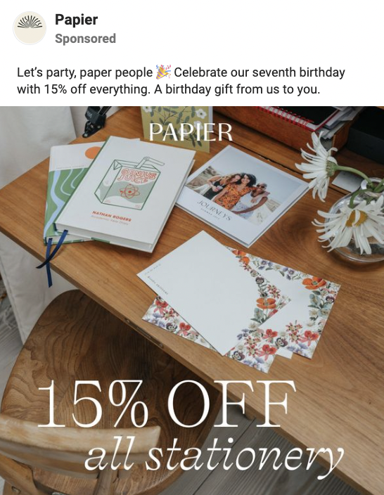
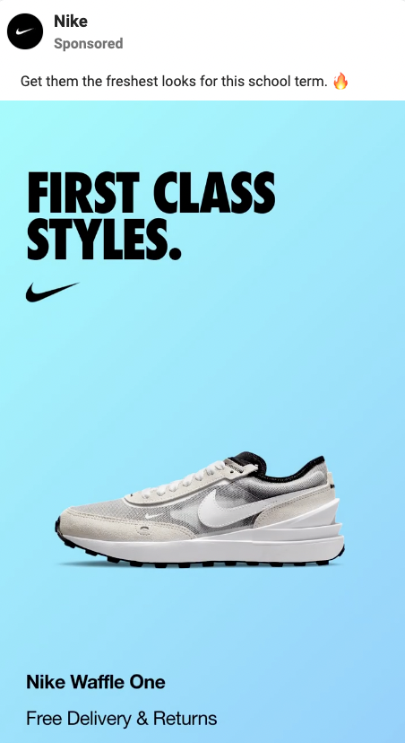
Depending on your brand image and style, prepare graphics that showcase your products in the best light possible.

Create graphics that are engaging to look at, pull in attention and quickly give your audience all the key information they need to know. That might be USPS, product features or ratings.

Whether it’s raw imagery or lifestyle imagery, your ad creatives should convey your brand personality and grow your audience’s interest. 

Just be sure to avoid adding too much text – ‘busy’ graphics can cause information overload and prompt Facebook users to keep on scrolling past.

Keep things simple- your audience can find out more about your product offering on your site.

 

2- Craft up short headlines

A great way to communicate your brand identity and assert your product as a key market contender, as well as pause a Facebook user’s scroll, is to include an eye-catching headline within your graphic.

These could be a short phrase about a featured product/collection or a punchy customer review that creates a strong first impression. 

Consider the reading experience here if there’s more than one section of text overlay. The viewer is more likely to begin at the top left and work across/down, so make sure they read the most important message first.


 

3- Test short, punchy captions

Captions appear above your ad creative on Facebook – but it’s likely your audience will view your eye-catching creative first.

Your caption provides further, and sometimes more detailed, information about your range, or a bestselling/new product featured in your ad. 

It’s tempting to give your audience everything they need to know here – but it’s best to be selective. Communicate those key USPs/features, describe your product in a sentence or two- then entice the audience to visit the site to find out more/make a purchase.

Don’t write a lengthy paragraph for your caption – on first impression, these are rather overwhelming sights. Consider the experience of your audience and keep captions punchy and easily digestible. 

Whether you break captions down into many lines or stick to one short section, they’re more likely to be read if they seem easy to read on first glance.

 

4- Add emoji in captions

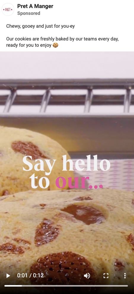
If including a few emoji would match your brand identity and the personality you wish to convey in ads, then this is a great practice for drawing eyes to your captions. 

Emoji are colourful, expressive and can communicate key messages in one simple image. Whether you prefer facial expressions, objects or emoji that encourage actions (like arrows, shopping carts or timers), add a few to your captions to aid the reading experience.

Just be careful not to overdo it – more than 3 or 4 different emoji can make your ads appear ‘shouty’ and communicate the wrong message. 

Emoji like 🔥, ⚡️, 👀 and 💥 are popular choices for attracting attention and building hype, as are expressions like 😍, 🤩 and 😱. 

Alternatively, choose emoji that tie in with your product offering and represent your brand identity. For example, if you’re selling natural produce, using emoji like 🌿, 🌱 and 💚 can communicate this characteristic in an instant.
 

5- Try video content

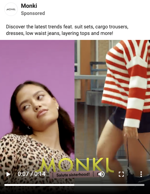
We’re seeing the growing use of video content on Facebook ads, as a more dynamic option than imagery. This could be a short animated GIF, or TikTok-style UGC showing your product in use.

With video content, you’re able to communicate more about your product offering without overwhelming your audience. With shorter attention spans, your audience will often respond well to video content that shows your brand personality.

Why not vary up your content in ad testing with video and imagery?
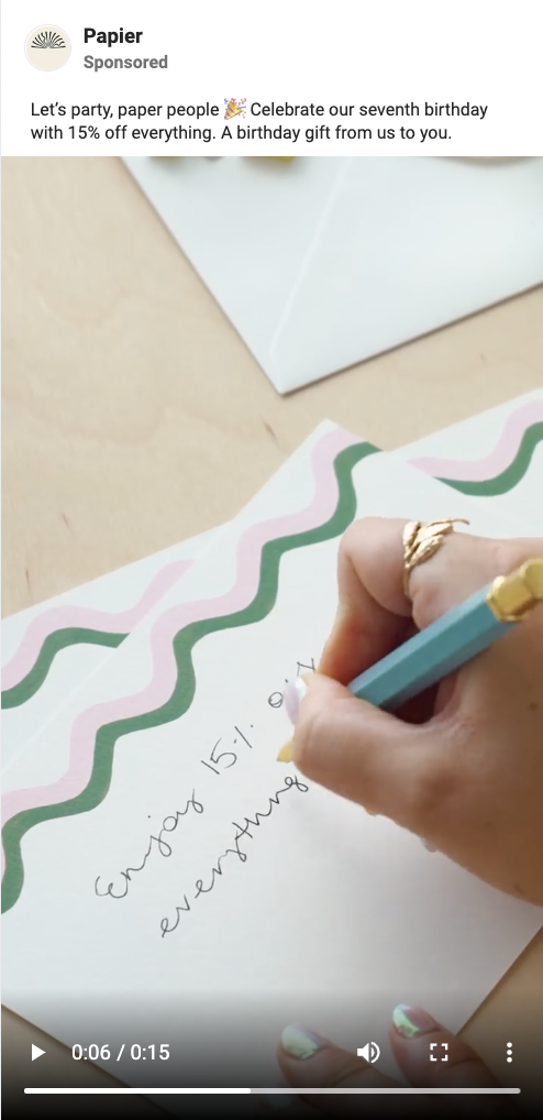
 

If you’re needing some assistance with implementing and testing your ads for maximised results, our marketing specialists are here to help.

With weekly testing of new content, plus expert insights on all things paid social, you’ve come to the right place for Facebook ad creation. 

Get in touch with our team today to find out how we can help your business grow.

Categories
Uncategorized

“Make Instagram Instagram again” : the new TikTok-style Instagram update

Is Instagram turning into TikTok? Here’s what’s changed on the platform – with a Kardashian-approved petition attempting to stop the transformation.


Instagram has been the subject of multiple changes over the past few months – but the latest overhaul has some calling the platform a ‘TikTok wannabe’. Some Instagram users have witnessed a significant change on their feed design, as the platform tests a more ‘immersive’ experience in which videos (Reels) are given more space on the feed. 

For these users, posts take up a larger space on the screen and the background has changed to black. In other words, it’s seemed to turn into a TikTok-esque, ‘For You Page’ format.


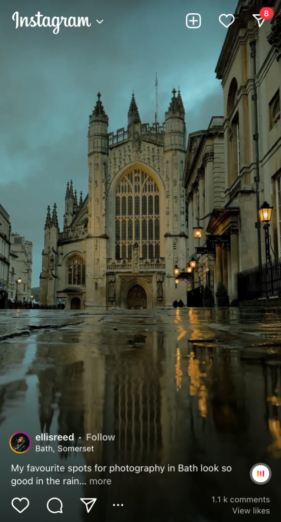
How the Instagram feed appears to those with the new update – looking increasingly similar to the TikTok ‘For You Page’.


Even if you haven’t received the full update, you’ll notice that short-form videos are given significant priority over photo-based posts, and posts from ‘suggested accounts’ continually appear on your feed. The algorithm now seems to be finding creators and accounts that match users’ interests and viewing history, and placing them higher on the feed than users’ own friends’ posts.


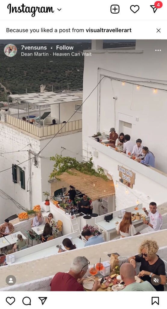
How the feed appears before the newest update – with accounts being ‘suggested’ to you according to your topics of interest.


It means that the Instagram experience is changing into a place of discovery rather than connection with friends and family- just like TikTok. This video-sharing app was primarily made for entertainment purposes and sharing dynamic content – and Instagram quickly caught on with the highly-shared video content, creating Reels in August 2020. 

Yet it seems that now, the video/image scales have been tipped slightly too far than Instagram users are comfortable with. While it’s true that short-form video content is highly shareable and engaging, and it’s understandable that Instagram has capitalised on this to optimise the user experience – it’s important that the platform keeps its original essence. 

Instagram was created in 2010 as a photo-sharing app, inspired by founder Kevin Systrom’s passion for photography. And its users’ love of creating and sharing a personal photo album with their nearest and dearest has never wavered, even in the face of change.


A step back in time: how Instagram used to look in 2014 – with a complete focus on users’ photos.


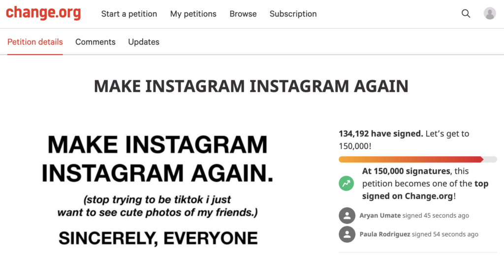
This is the sentiment behind the now-viral petition sweeping across the internet, calling to “Make Instagram Instagram again” and for the platform to “stop trying to be TikTok”. Created by Tati Bruening, the petition suggests bringing focus back to photos (not solely on video content) and re-introducing the chronological timeline that showed us our friends and family’s posts in real time.


Tati Bruening’s now-viral petition calling for the revival of the old Instagram platform.


Created only 3 days ago, this Change.org petition has now, rather incredibly, received over 134K signatures (at the time of publication) – if it reaches 150K it will be one of the top-signed petitions on the site. Notable signees include the influential queens of Instagram themselves, Kylie Jenner and Kim Kardashian, who have added their voices to the ring and shared the petition on their Instagram Stories.

With high-flying influencers and creators also speaking up on the changes, it’s hoped that those behind the platform will listen to what the people seem to want. Which is: retain the original purpose of the app, alongside its move to include video-based content. 

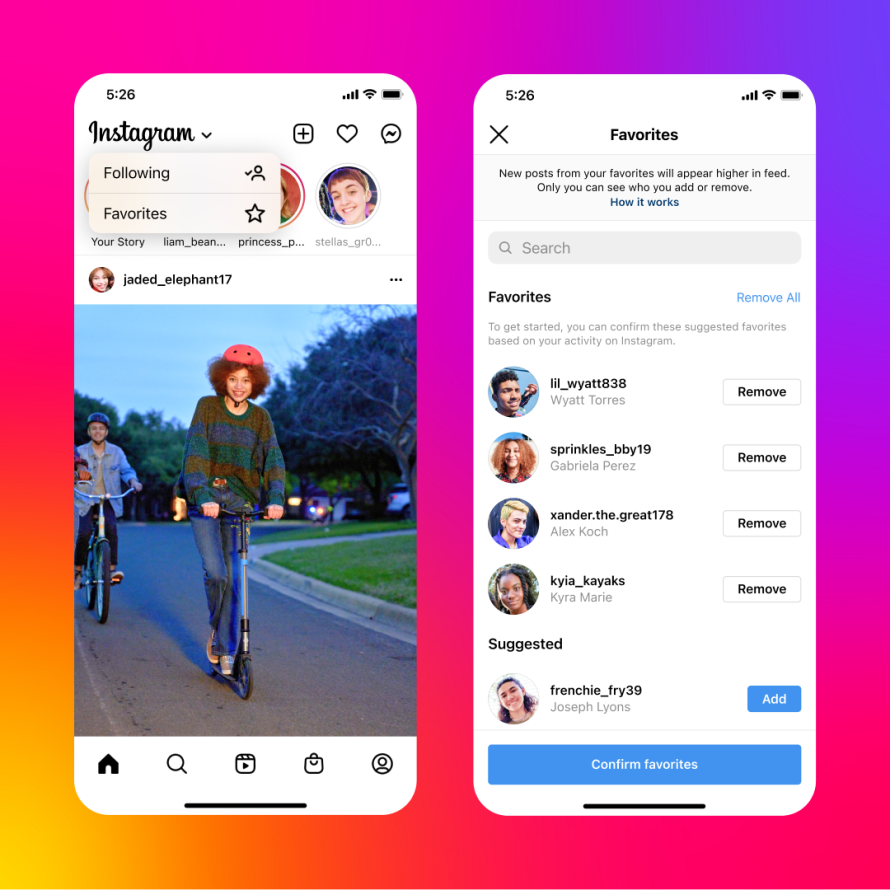
This wave of mutual dissent over Instagram’s update isn’t about rejecting change. It’s about supporting the platform’s originality and preserving the reason it was created. Updates like Instagram Stories and the ‘Favourites’ filtered feed have been warmly received by users – but this feed overhaul seems to many like a step too far.


A recent addition to the platform is the ‘Favourites’ feed, which allows users to create a feed full of their favourite accounts and creators.


While we wait and see what becomes of this collective call for change (or rather, the retracing of steps), it’s important to stay on top of these fast-changing platforms and use popular features to your advantage. 

If video-based content is pushed more than photo-based posts by the Instagram algorithm, it’s vital to reflect this in your social media strategy, or you risk a low reach and an even lower engagement. It’s important to be flexible and responsive to change in this landscape – despite your personal preference – so you get the recognition and reach you’re looking for.

If you need help with keeping up with social media updates and staying ahead of the curve, get in touch with us today. We’re a team of digital marketing experts ready to help you take your brand to the next level – book a call with us now to discuss your strategy and goals 🚀