Want to improve your site performance, and lower your bounce rate? It’s time for a landing page refresh. The most successful landing pages take the viewer on a journey from pain point to solution, no matter if they’re completely new to the brand or if they’re returning to the site to compare with competitors.
It’s vital to invest time and effort into your site experience- to build a strong first impression following from your paid and organic marketing efforts. In this article, we’ll go through the most important things to remember as you embark on creating a high-converting landing page.
First up, what sections are vital to include on your landing page?
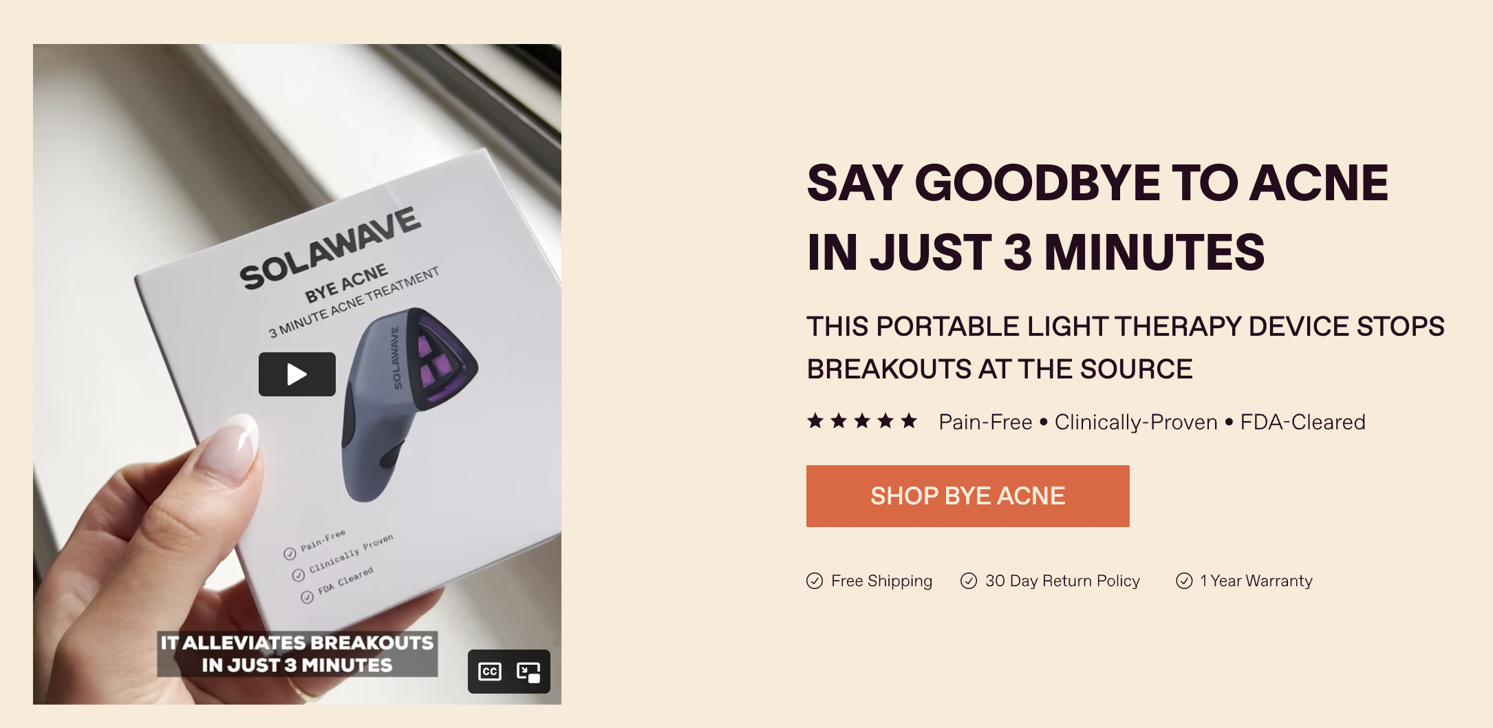
Hero section
The very first section on the page, complete with a memorable headline and eye-catching visuals to capture attention and interest. Show the product, either static or in use, and address the audience’s main pain point(s) in the headline.

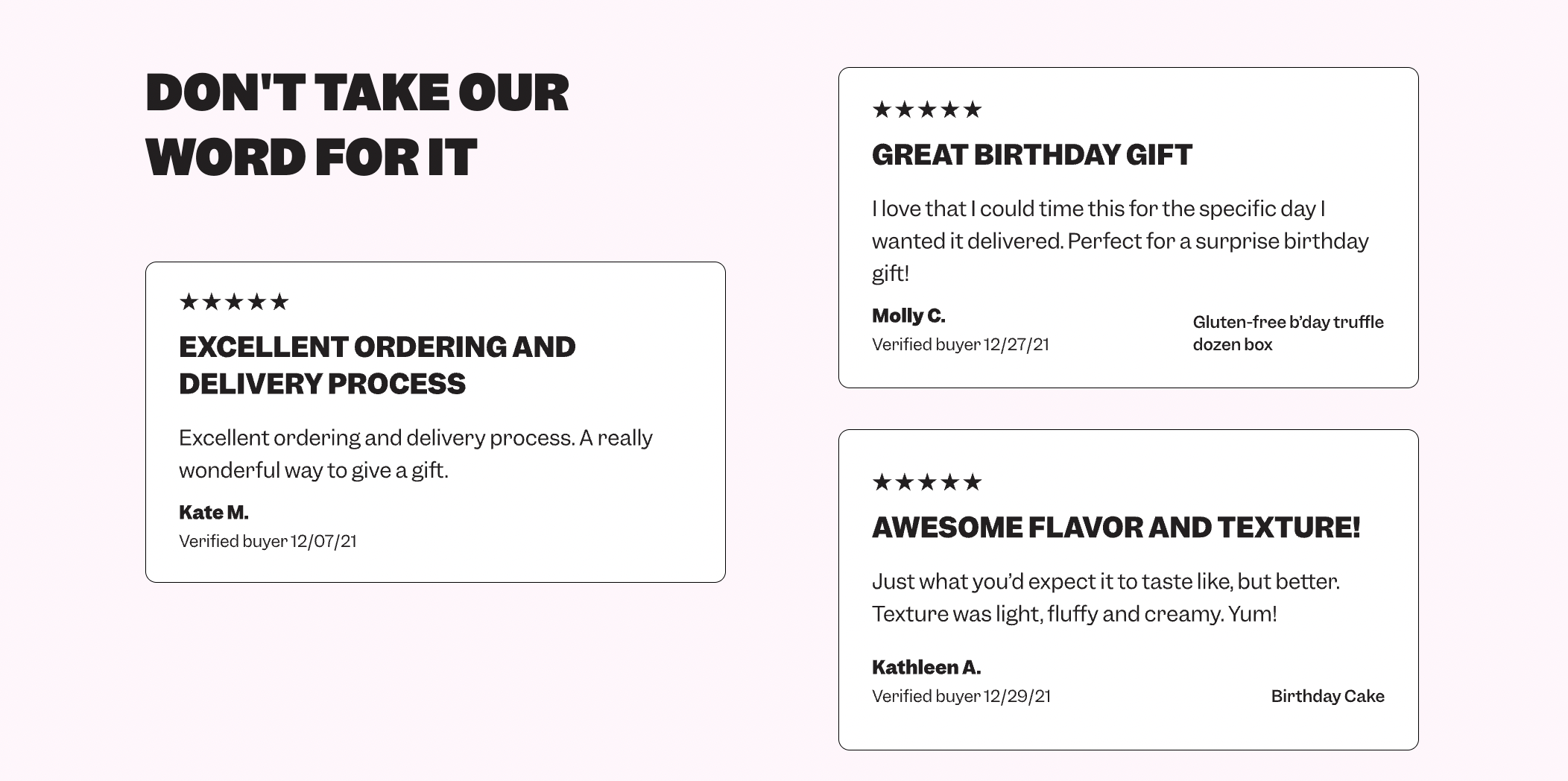
Social proof section
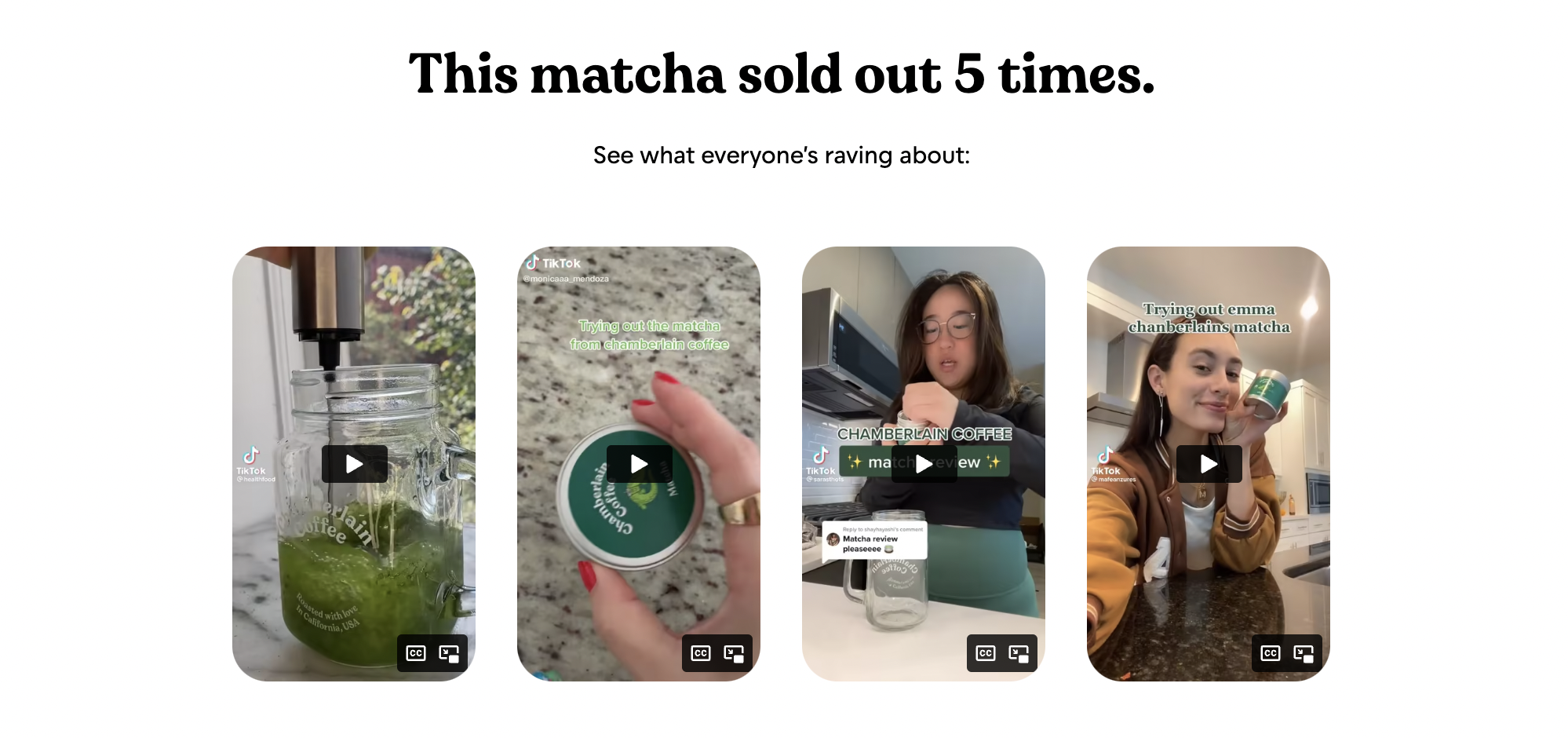
Tied to the hero section (as seen in the above example), make sure the audience can see straightaway that your product can be trusted. This could be in the form of ratings, testimonials, publisher accreditations, or short-form quotes that relate to the audience. If you’ve got UGC of your product- create a gallery! A video speaks a thousand words when building the audience’s confidence.
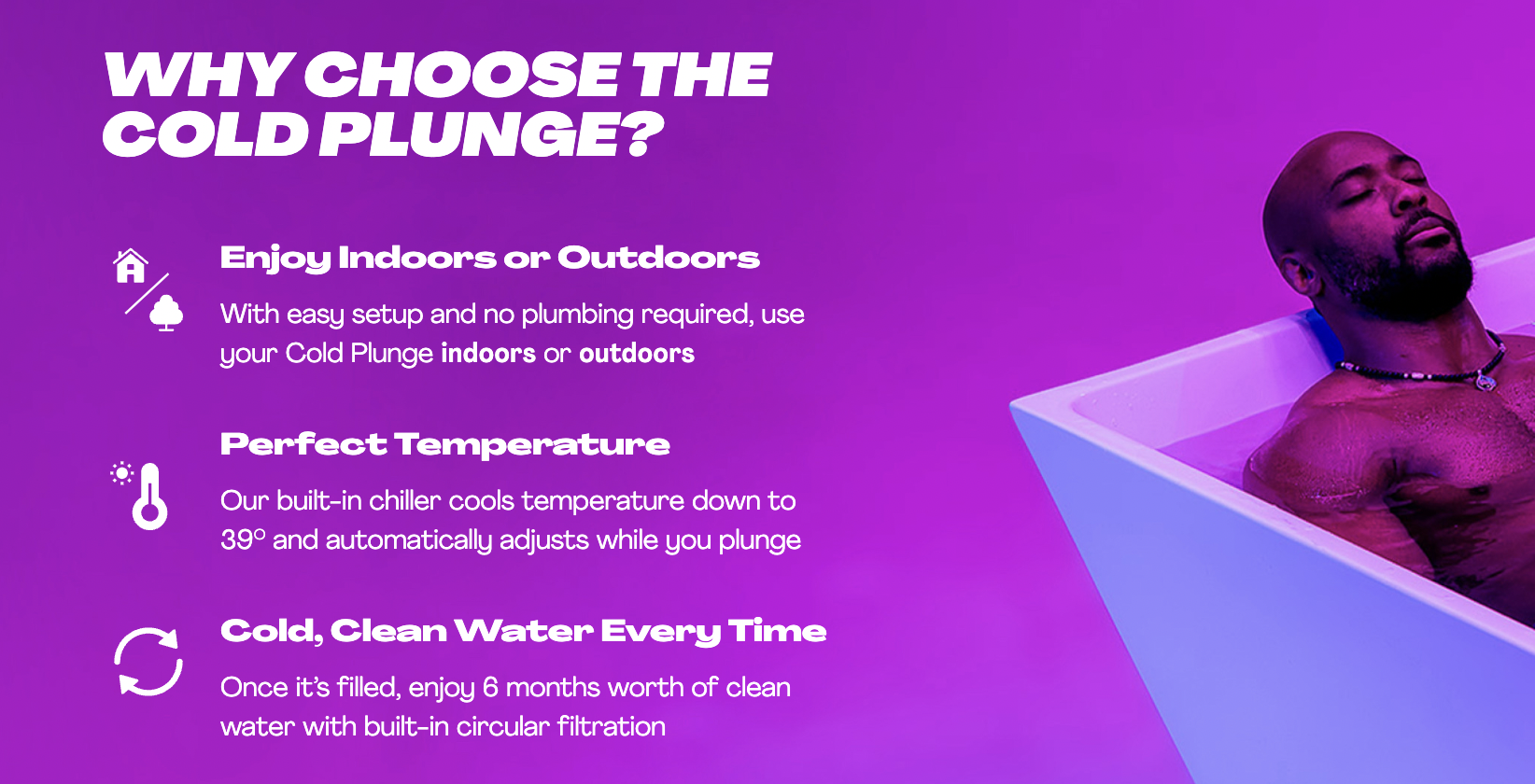
‘Why’ section
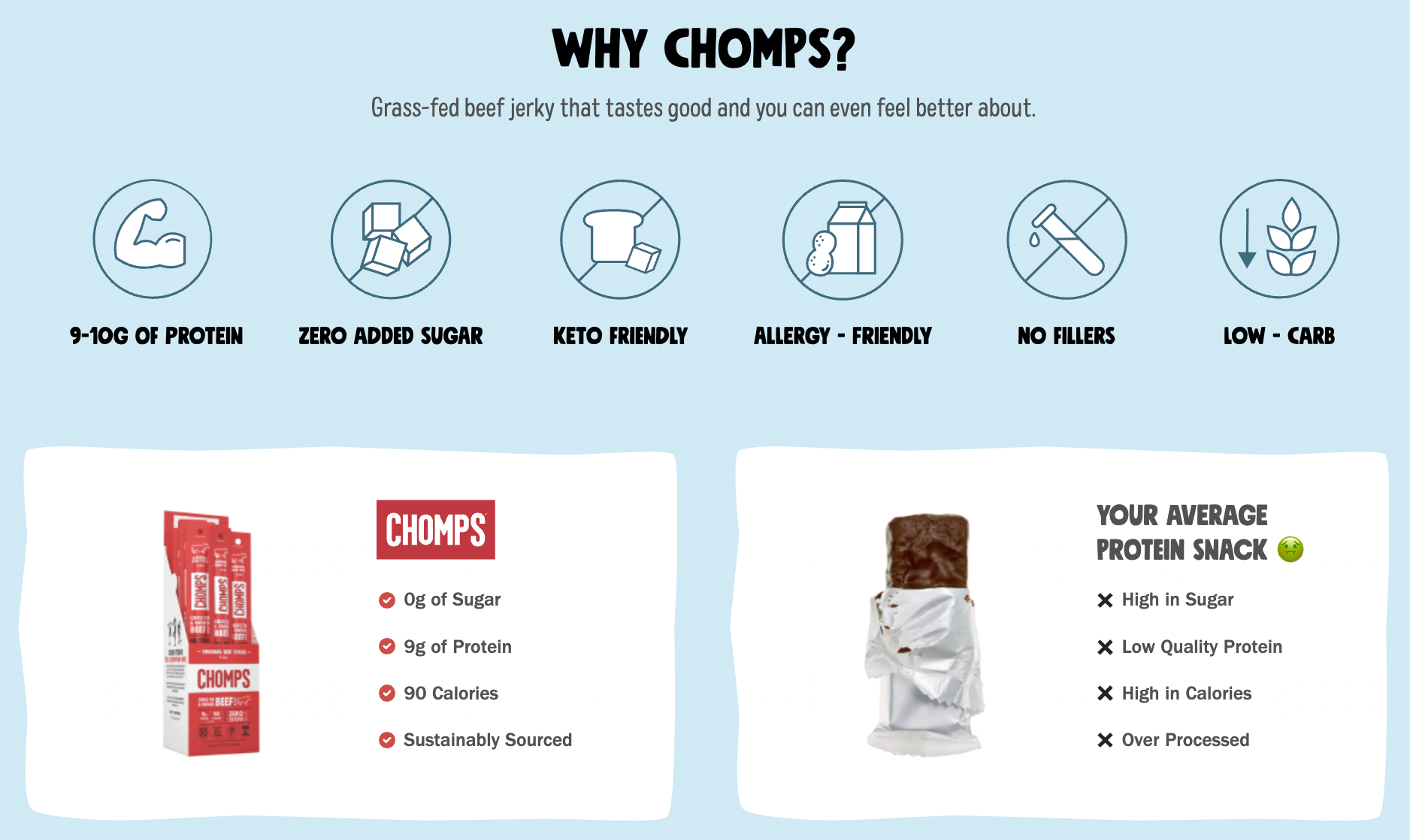
This section gives your chance to pitch to your customers – why should they care about your product? What does it provide? What does it solve? What makes it different from any competitors?
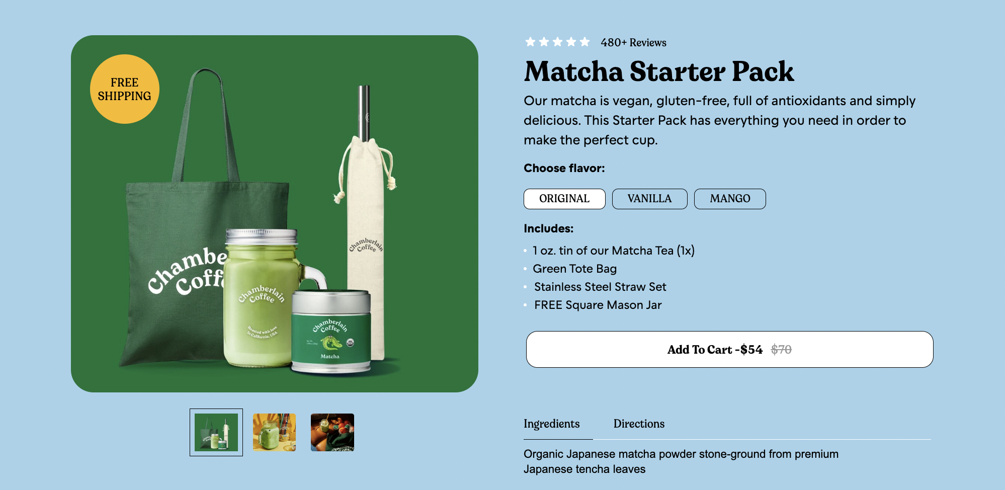
‘Shop’ section
Once your customers start to learn about your product and what others are saying about it, it’s time to give them a clear opportunity to buy. Outside the CTA buttons distributed across your page, this section allows you to collect up all the vital information about your product (what’s included, features, variations, price etc) plus further incentives to buy (trial periods, free shipping etc).
You might like to include multiple sections for each type, if there’s lots to educate on and you don’t wish to overload your page visitors. Just make each section unique and provide value of its own.
Now we’ve set out the key structure to follow, it’s time to share some website wisdom. Read on for the proven strategy to create a high-performing page that speaks to your audience.
1 – Lead with education
How to keep your audience engaged from start to finish, as soon as they cast their eyes on your site? Educate from the beginning- in the initial headline, tell them how your product can solve their problem, to ignite their curiosity.
As they scroll through your page’s contents, you’ll take them on a journey from problem to solution, and why exactly this product would be valuable to them. You’ll educate them, engage them, and motivate them to buy- they’ll get value from you, and in return you’ll get a more likely sale.
2 – Build trust with social proof
Make sure you lead not just with your words, but the powerful words of your customers. Outside your main social proof section, there might be good opportunities further down the page to include a headlined quote, or a featured UGC review- anything that will further encourage visitors to progress to purchase.
3 – Give plenty of opportunities to convert
Think about audience experience at all times. Make CTA buttons feel natural to their reading experience – but subtly powerful in encouraging them to make a purchase. Ensure there’s always an opportunity to move to conversion in all stages of the scroll- but ensure you hit that sweet spot between overly-persuasive selling and an absence of clear CTAs.
And- ensure the audience members that make it to the bottom of the page get a unique push, after absorbing all the value you’ve given them as they’ve scrolled the page. All things considered, what do they need to hear?

4 – Be creative with layout
Avoid your landing page looking text-heavy- keep your audience engaged by making your educational content easily digestible, via labelled images, infographics, swipeable sections, etc. Images are more memorable than text blocks- think how you can keep your product in your audience’s minds.
And that’s a wrap! Your introduction to creating high-flying landing pages that stand out from the rest. Your website is where it’s at; no matter how great your paid/organic marketing is, this is where your customers are convinced to purchase from you- so make it really count!
The key buzzwords to remember here are: education, value, engagement and memorability. By striving for these, you’ll be able to impress customers and elevate your site to a whole new level. Don’t stay behind the curve- it’s time to get ahead 🚀
Want to boost your eCommerce results?
That’s where we come in. Get in touch now by booking a call with our expert team- we’re looking forward to seeing how we can help you!

