
The Psychology of Colour in Advertising
When it comes to content marketing, colour is key. Colour psychology has been around for years. It is an area of research that examines how colour influences our behaviour as consumers. Different colours can impact the way buyers perceive a brand in ways that aren’t always apparent. It is an emotional cue that can help your audience feel what you want them to feel simply by using different colours and is why understanding colour psychology is so important for the success of your content.
Using the wrong colour choice can negatively impact your advertising and send out the completely wrong message. Today, we’re going to go over the main colours, what they mean for your advertising, and where to use them.
Red
Red is a very powerful and dynamic colour. It triggers powerful emotions, both positive and negative. It often represents our physical needs, whether that’s affection, love, fear or terror. Red is also a very energising colour that can portray friendliness and strength, but depending on its context, can be very demanding and show aggression.
If you’re looking to portray a really powerful presence or to grab audience’s attention fast, red is the colour for you. That’s why you will often see sale signs in red as it creates a sense of urgency. Just a warning, be careful using red, as it does carry some negative connotations. Use it sparingly.
Orange
Orange is a very warm colour and has similar connotations. This mix of yellow and red represents physical comfort. Orange is often associated with motivation, a positive outlook and general enthusiasm.
It’s a fun and bright colour, so often suited to a non-corporate brand. Orange is also thought to induce feelings of hunger, meaning it could be a perfect choice for a food brand!
Interestingly, orange has been associated with cheapness, so be careful using orange if you’re going for a luxury vibe.
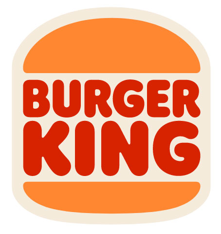
Brand Example: Burger King
During their iconic rebrand, Burger King have gone for an eye-catching pop of orange in their new logo which works perfectly given their key intention is to make customers hungry. They also don’t need to worry about about ‘cheapening’ their brand as they sell themselves as affordable, attainable fast food.
Yellow
Everyone loves yellow. Yellow is the epitome of joy, happiness, cheerfulness and optimism. Anything yellow almost always represents something happy and joyful. It’s been proven that infants first respond to yellow above any colour, proving that yellow is the easiest colour to visually see.
You should use yellow to lift people’s spirits and confidence but should be used carefully as yellow often has connotations with anxiety, caution and fear. If you know your brand is strongly associated with confidence and happiness, use it. If there’s any room for doubt, avoid it. Find the right balance to motivate your audience instead of bringing them down.
Brand Example: McDonalds
McDonalds’ iconic ‘M’ in their logo is a great example of colour psychology. They want their restaurants to be the epitome of happiness, fun and good food. The yellow colour of their logo helps customers associate these feelings with their restaurant.

Green
Green is a lovely colour of balance and harmony. It’s a visually appealing colour, easy on the eye, which gives us a clear sense of right from wrong (due to the fact that it incorporates a balance of both the logical and emotional). Green is the colour that represents natural life, rest and peace. It’s also a sign of growth, whether that be physical or financial.
Green is a very common colour used across health and organic brands, as well as pharmaceuticals.
If you’re looking to portray health, rest, growth, or finance, green is the colour for you. Green does have some negative associations with possession and materialism; however, the positive connotations outweigh the bad in this case.
Blue
Blue is famous for its reflection of trust and dependability. It has a very calming effect on the mind and is often referred to as the colour of reason.
Unlike the colour red, blue tends to create a mental reaction, as opposed to a physical one, that allows us to destress and calm down. It’s the colour of mental strength and wisdom.
Of course, blue does have some connotations of sadness, coldness and can often make you appear quite distant if used in great amounts. Use this colour with caution and only if it fits your brand.
Purple
Purple is a colour associated with the imagination, spirituality and royalty. It possesses all the energy and power of red, alongside the stability and trustworthiness of blue, making it the perfect balance between the physical and spiritual.
If you’re a luxury brand, this is the colour for you. It is often seen as quite a moody colour, and different tints of purple can be used to represent femininity.
Purple is a very intriguing colour, but also leaves space for mystery and new ideas. Creativity is often associated with this colour. However, you should avoid using this too much as it can leave a bit too much room for introspection and distraction.
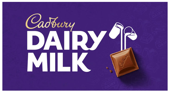
Brand Example: Cadburys
Cadburys is actually a really interesting example as their iconic purple packaging doesn’t necessarily relate to any of the typical emotions related to this colour. They’re an affordable, every day brand using colours often associated with royalty and wealth. This is a perfect example of how iconic brands can redefine the psychology behind colours and often do.
Pink
Pink often represents compassion and unconditional love. It’s often seen as a very physical and soothing colour, associated with hope and romanticism. It is also the most widely used colour to portray femininity.
If used too much, pink can be very draining, display a lack of power and even come across immature. Pink is great to use instead of red when appropriate.
Black
Sophistication, seriousness, control and independence are all associated with the colour black. It is a very reserved colour, that lacks any light. It is synonymous with luxury and power and is often well suited to fashion industries.
Black can also be used to shoe evil, mystery and even death, so as you can imagine, using too much of it can create an aura of sadness and negativity. So, use it sparingly. Maybe use it more in your text than visuals themselves.
Gold
Gold is thought to be a rich colour that represents royalty, wealth and money. It has connotations of charm, confidence and friendliness, so is best used for brands that are friendly and conversational. It is more often than not a positive and inspiring colour.
However, when used too much in one space, gold can feel egotistical, self-righteous and too proud. Try to use this colour sparingly to highlight, rather than be the main centre-piece.
Silver
Silver is commonly associated with ‘second place’ or second best. It is still seen as a somewhat wealthy and regal metallic but less so than gold.
It is also a colour synonymous with cleanliness and has become the go-to for modern brands. However, if poorly executed, it can look lazy and lack personality.
Silver is thought to trigger the emotions of hope and sensitivity. It is believed to be the mirror to the soul. It is this association that also makes silver feel clean and trustworthy.
Silver feels sturdy and reliable meaning it is often a positive colour in the marketing world.
Now, you should be a colour psychology expert. Next time you are creating your visuals or thinking of your next big campaign, refer back to this article. You cannot know how your audience will respond to your colour choices without creating thoughtful A/B tests to determine which colours generate the most sales.
Still need some help with your content? We have an amazing in-house team of graphic designers who can help you determine the best colours to use for your marketing campaigns.