Social Nucleus

Categories
Uncategorized

Why your business needs a marketing growth partner this Black Friday

Read on to find out how a marketing growth partner could help your brand reach new heights this Q4.


The busiest time of the marketing calendar year is coming up – the run up to Black Friday and Cyber Monday. There’s a whole host of marketing activities to do to ensure this period is a successful one for your business.

If you’re unsure of where to start, it’s worth investing in a team of marketing experts to get your brand out there, ready for Black Friday. 

Sometimes a helping hand can work wonders for your online reach and brand awareness, especially if you need time to clue up on the world of social media marketing, paid social advertising, or email marketing, before you can get stuck in to strategy and content creation.

It’s more important than ever to establish an online presence for your brand, to get your message out there and reach your target audience. And there’s experts out there who can jump straight onboard and help you achieve your goals.

Like us, for example (!).


What’s a growth partner?

Unlike an agency, we don’t consider ourselves an ‘external source’ for marketing services. We’re a dedicated partner to your brand, working with you, not external to you, to achieve success.

By collaborating with you and your goals, we’ll draw from our experience of scaling brands to help you grow and achieve your vision. Our success truly is your success – that’s what a partnership with us means.

We’re here to work together, as an extension of your business, to strive for your growth. We constantly innovate, testing new ideas and optimising the tests that work.


Call us your fully-functioning marketing department. We completely integrate with the way your business works, instead of operating from the sidelines.

You can leave it to us to fire up your marketing strategy, clued up on all the industry knowledge and expertise that will help you get the results you’re looking for.


How we can help

Let’s break down the variety of services you might consider for Black Friday :


Paid Social Ads –

Reach new and retargeted audiences and optimise your success on the daily. By the time Black Friday rolls around, we’ll have a good idea of the type of copy and content that stops scrolls and gets clicks.


Paid Google Ads –

Build your brand awareness and boost website traffic with paid search. Make it easier for your customers to find your brand when they search for the products you sell.


Email Marketing

Nurture a loyal customer base with email campaigns that engage, reward and bring value. Make sure your customers remember your offers and discounts when Black Friday arrives.


Social Media Marketing –

Take your social media output to the next level with content that gets you noticed and trusted- from Instagram to TikTok. Build your brand awareness and engage your audience with dynamic video, imagery and graphics that creatively capitalise on trends. 


Brand Management –

Elevate your brand identity and build your customer base with a recognisable tone of voice, visual branding and messaging across your marketing channels. As it’s not just about short-term efforts to get conversions, but long-term trust-building.


How does a growth partnership work?

When you get started on your onboarding, we’ll get stuck into getting to know your brand, inside out. We’re talking competitor research, TOV research, and full audits across your ad accounts and content output. 

We’ll get to know your brand culture, what’s important to you, and what you’re determined to achieve in both the near and distant future. Then you can be sure your new growth partner is fully onboard with your brand and can create the kind of content you’d love to see.

In the weeks leading up to Black Friday, we’ll be testing what works best, so we’re ready to build on this when it counts the most.


What are my next steps?

Why not get in touch and find out more about how we can help your brand this quarter? 

We’re an innovative, creative and ambitious growth partner, ready to help you scale up 🚀

Book a call with our friendly team today to ask any questions and discover more about our services, onboarding process and growth mindset.

Categories
Uncategorized

5 Ways to Get Your Ads Noticed on Facebook

If you’re creating paid Facebook ads or planning to test on the platform, it’s crucial to ensure your ads will succeed in capturing the attention of your audience.

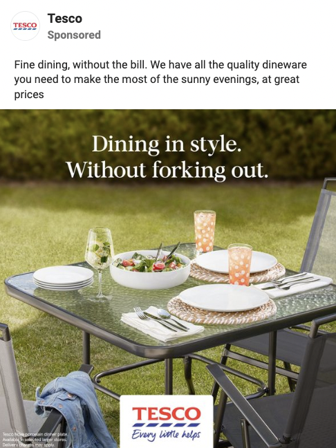
Picture this – your target audience is scrolling through Facebook and browsing their feed. Your ads need to stand out – so eye-catching creatives and copy are the way to go.

To use the platform to your advantage, it’s important to always consider this audience and how you can quickly gain their attention as they scroll.

We’ve pulled together 5 ways to make sure your ads are more likely to deliver on clicks and conversions on Facebook :


1- Use attention-grabbing creatives

Depending on your brand image and style, prepare graphics that showcase your products in the best light possible.

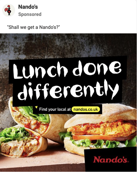
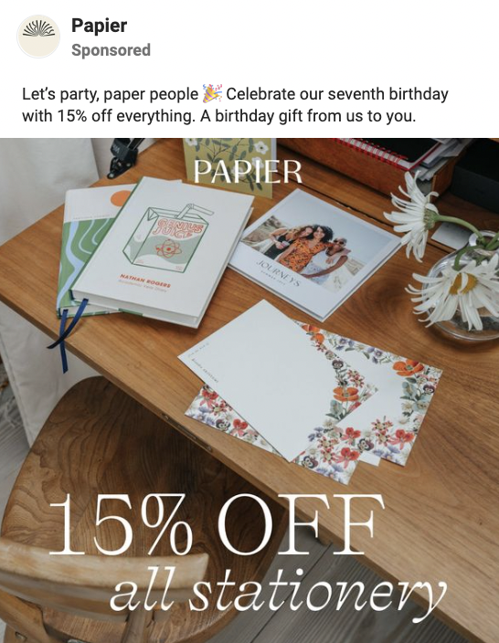
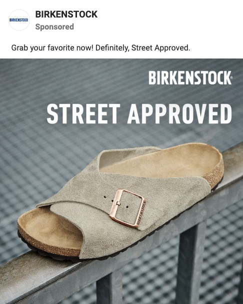
Create graphics that are engaging to look at, pull in attention and quickly give your audience all the key information they need to know. That might be USPS, product features or ratings.

Whether it’s raw imagery or lifestyle imagery, your ad creatives should convey your brand personality and grow your audience’s interest. 

Just be sure to avoid adding too much text – ‘busy’ graphics can cause information overload and prompt Facebook users to keep on scrolling past.

Keep things simple- your audience can find out more about your product offering on your site.


2- Craft up short headlines

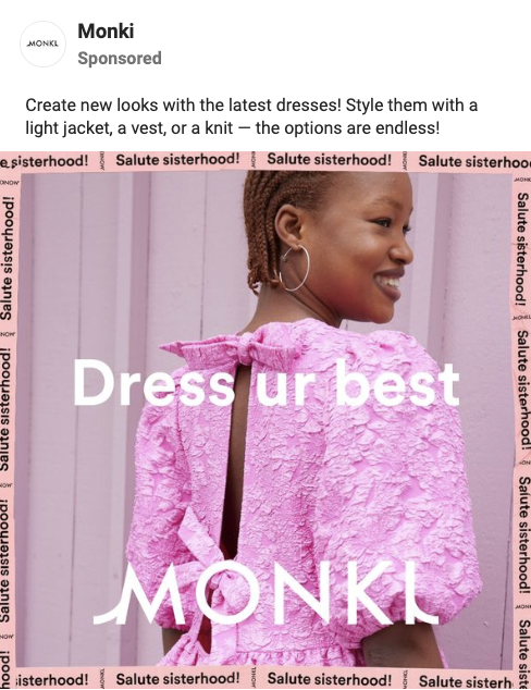
A great way to communicate your brand identity and assert your product as a key market contender, as well as pause a Facebook user’s scroll, is to include an eye-catching headline within your graphic.

These could be a short phrase about a featured product/collection or a punchy customer review that creates a strong first impression. 

Consider the reading experience here if there’s more than one section of text overlay. The viewer is more likely to begin at the top left and work across/down, so make sure they read the most important message first.


3- Test short, punchy captions

Captions appear above your ad creative on Facebook – but it’s likely your audience will view your eye-catching creative first.

Your caption provides further, and sometimes more detailed, information about your range, or a bestselling/new product featured in your ad. 

It’s tempting to give your audience everything they need to know here – but it’s best to be selective. Communicate those key USPs/features, describe your product in a sentence or two- then entice the audience to visit the site to find out more/make a purchase.

Don’t write a lengthy paragraph for your caption – on first impression, these are rather overwhelming sights. Consider the experience of your audience and keep captions punchy and easily digestible. 

Whether you break captions down into many lines or stick to one short section, they’re more likely to be read if they seem easy to read on first glance.


4- Add emoji in captions

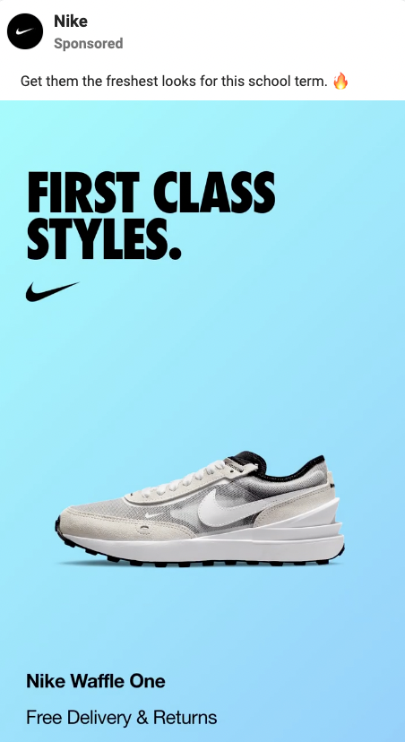
If including a few emoji would match your brand identity and the personality you wish to convey in ads, then this is a great practice for drawing eyes to your captions. 

Emoji are colourful, expressive and can communicate key messages in one simple image. Whether you prefer facial expressions, objects or emoji that encourage actions (like arrows, shopping carts or timers), add a few to your captions to aid the reading experience.

Just be careful not to overdo it – more than 3 or 4 different emoji can make your ads appear ‘shouty’ and communicate the wrong message. 

Emoji like 🔥, ⚡️, 👀 and 💥 are popular choices for attracting attention and building hype, as are expressions like 😍, 🤩 and 😱. 

Alternatively, choose emoji that tie in with your product offering and represent your brand identity. For example, if you’re selling natural produce, using emoji like 🌿, 🌱 and 💚 can communicate this characteristic in an instant.


5- Try video content

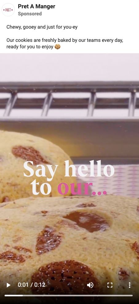
We’re seeing the growing use of video content on Facebook ads, as a more dynamic option than imagery. This could be a short animated GIF, or TikTok-style UGC showing your product in use.

With video content, you’re able to communicate more about your product offering without overwhelming your audience. With shorter attention spans, your audience will often respond well to video content that shows your brand personality.

Why not vary up your content in ad testing with video and imagery?


If you’re needing some assistance with implementing and testing your ads for maximised results, our marketing specialists are here to help.

With weekly testing of new content, plus expert insights on all things paid social, you’ve come to the right place for Facebook ad creation. 

Get in touch with our team today to find out how we can help your business grow.

Categories
Uncategorized

7 ways to optimise your website conversion rate

No matter the efficacy of your paid social ads or email marketing campaigns, your website is where the most important step occurs for your business: conversion. That’s why it’s incredibly important to ensure that your website’s conversion rate is fully optimised.

Whether your customer knows your brand from your organic social media presence, or has come across your website and brand for the first time, your website needs to provide a smooth and simple process from your customer visiting the landing page to completing their purchase.

Here’s 7 ways you can boost your website conversions – all proven to optimise conversion rate.


1. Add a pop-up to your landing page(s).

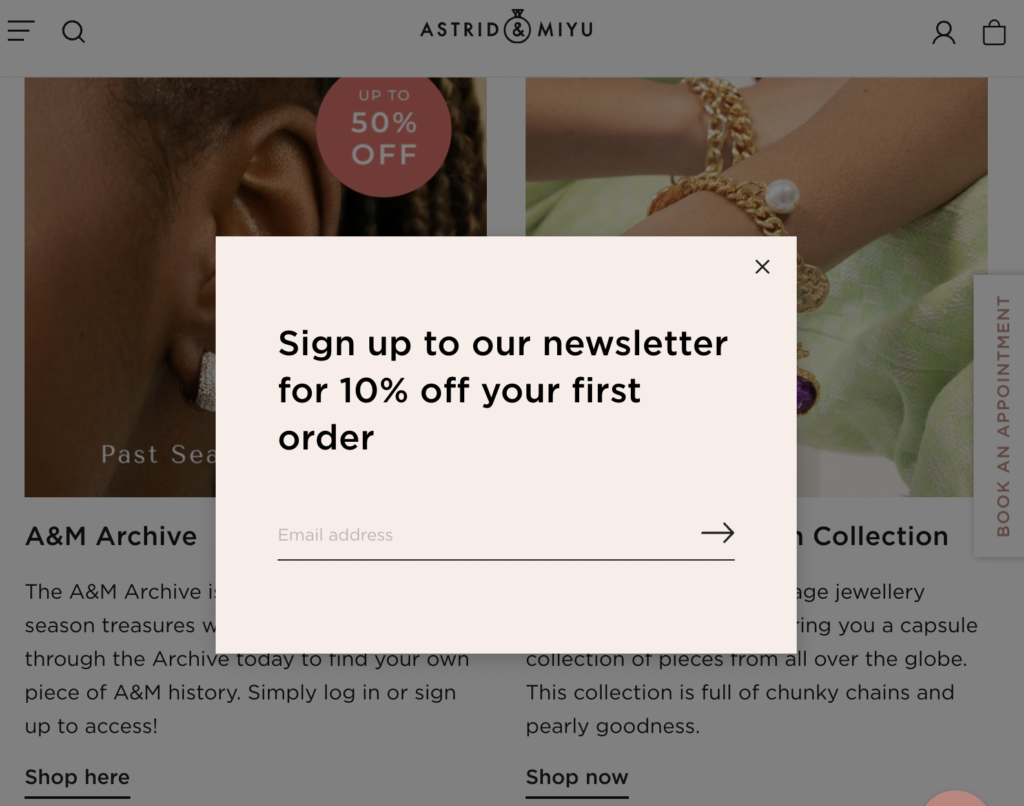
A pop-up is a great way to entice customers to make a purchase, advertising a first-order offer or product/bundle discount, for example. You can test different incentives until you reach the highest conversion rate.

Ensure your pop-up appears with a 30 second delay and is easy to close, so that it doesn’t annoy site visitors. You can also set a cookie to make your pop-up message only appear once per user.

The top website pop-ups can reach a conversion rate of nearly 10% (for every 100 website visitors, 10 make a purchase via the pop-up message). Give it a try to boost your conversions.


pop up on wesb


2. Include social proof.

Your customer wants to make sure their purchase will be worth their investment – and customer testimonials and reviews can help build their trust. According to Trustpilot, 89% of consumers check online reviews before making a purchase – and you can make this investigative process easier by including social proof on your site.

By quoting happy customers on your landing page, as well as a dedicated review page and a link to third-party review sites like Trustpilot, you’ll be able to build potential customers’ certainty that your product/service is worth investing in, leading to increased conversions.


3. Keep pages simple and easily navigable.

From the first glance, customers shouldn’t feel overwhelmed by a busy and cluttered landing page. It’s crucial to keep your website’s design simple, clear and easily navigable – so that visitors focus on your offering and make a seamless journey towards a purchase.

Don’t include something if it isn’t essential or valuable to the customer journey. Every page and section needs to clearly lead to conversion. Include a headline/subheadings, your product’s benefits/features/USPs, testimonials/reviews and visual creatives/animated content.

The more content your visitors have to scroll through to find out about your products and make a purchase, the less likely they are to convert. Make sure the experience of visiting your website is smooth and straightforward- with minimal distractions.


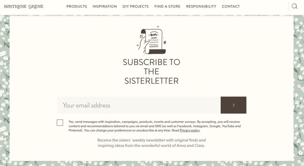
4. Simplify your sign-up form.

When customers begin to fill out a sign-up form to receive your newsletter and create an account on your site, they wish to complete the process quickly. It’s your job to make sure this is smooth- by only requesting essential information. This might just be their email address – leave the ‘how did you hear about us?’ to the post-purchase survey.

You can even add a 3rd-party sign-up service to eliminate any form-filling, such as allowing the customer to use their Google or Facebook account. Ensure you give your customers a seamless experience from start to finish.


5. Strengthen CTA copy.

Rather than constantly sticking to CTA copy like ‘shop now’ or ‘sign up’, more creative copy can generate greater conversions as it subtly, yet powerfully, entices the customer to progress to the next stage of their journey on your website.

Adding the word ‘yes’ before a CTA psychologically paints it in a positive light, increasing the likelihood that a customer acts on the command;


Ensure your CTAs are clear and placed throughout your website and landing pages – so that there is always an opportunity to move closer to purchase, no matter how much a customer scrolls through a page. This may be the same CTA incorporated at several points throughout a page.

The sooner a CTA appears when the customer visits a page (ideally without scrolling first), the better.


6. Add a countdown timer.

Including a countdown timer on your landing page, added to a sale or offer advertisement for example, is an effective way to encourage quicker conversions. If customers see a timer, they’ll know something is exclusive and only available for a limited time (and therefore more desirable), and their sense of urgency to purchase will increase.


7. Offer a money-back guarantee.

Another great way to remove customers’ objections to risk and increase security in purchasing from you is to offer a money-back guarantee. By promising high quality and strong return on investment, a clear money-back guarantee on your website is an effective incentive for customers to move towards conversion.

Whether you boldly display this guarantee in your site’s visual creatives or you add it to product descriptions, make sure it’s clearly visible on the page so you can capitalise from its message.


The final thing to do is make sure your website is optimised for mobile– to increase conversions from this platform and improve your Google rankings. On mobile, the experience of viewing your website is different. Less is more on mobile- your mobile site should have further simplified navigation (making use of the hamburger menu). Utilise Google’s mobile testing tool to check whether your site is mobile-friendly and discover ways you can improve mobile performance.

It is advisable to take a look through your website through your customers’ eyes, and see what the experience might be like when you visit for the first time. Ask yourself questions like; is it easy to navigate? Does it make use of clear and well-populated CTAs? What could be added/changed to optimise conversion rate?

Keep in mind websites you’ve visited and purchased from in the past – these can act as strong models to follow to ensure your site effectively generates conversions.


So, there you have it. A comprehensive guide of ways to optimise your website’s conversion rate.

Need further help to create an effective, sleek website for your business and boost your online conversions? Get in touch with us today- we’re a team of marketing specialists offering brand development support and creative management, including paid social media ads and email marketing.

We’re experts in all things SEO and site performance- book a call in with us today and find out how we can help scale your business 🚀

Categories
Uncategorized

How to level up your marketing game with key marketing dates

Find out how to utilise upcoming marketing dates to your advantage with this handy checklist.

Got a few key marketing dates coming up that you want to use? Here’s a checklist for you to make sure you take full advantage of these in your marketing output.

We’ll be covering the following in this article :

1.Create an exciting promotion
2.Theme up on socials
3.Engage on email
4.Grab attention on ads


First of all, here’s a few dates you need to be paying attention to this month:

1st-30th June : Pride Month

3rd June : Platinum Jubilee Bank Holiday

5th June : World Environment Day

19th June : Father’s Day


Getting involved with dates like these is a great way to put your brand out there, stay relevant and engage with your target audience. It makes a creative way to reach your ultimate goal: driving website traffic and conversions.

To fully capitalise on upcoming marketing dates, it’s essential to prepare your content in advance, across your socials, website and ads. Then when the date rolls around, your campaign is strong and fully tailored to engage with your audiences.

Let’s go ahead and break down your campaign strategy, so you know exactly what you need to do to prepare for your next marketing date.


1. Create an exciting promotion

Setting up a special discount or product offer to celebrate a themed date is a great strategy to boost conversions from new and loyal customers alike. 

This could be exclusive to newsletter subscribers, with a themed code to use at checkout, or for all site visitors. To create a sense of urgency and exclusivity, consider adding a timer to your landing page or newsletter email, counting down to the end of the offer.

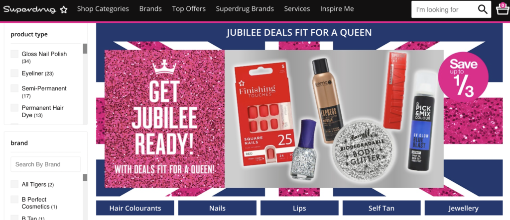
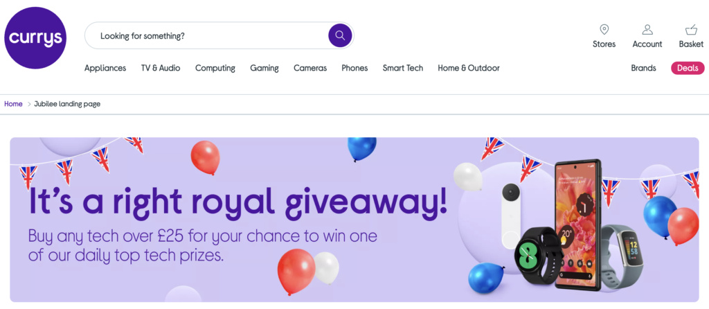
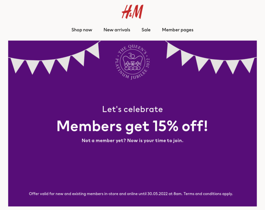
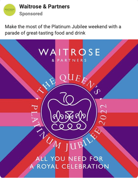
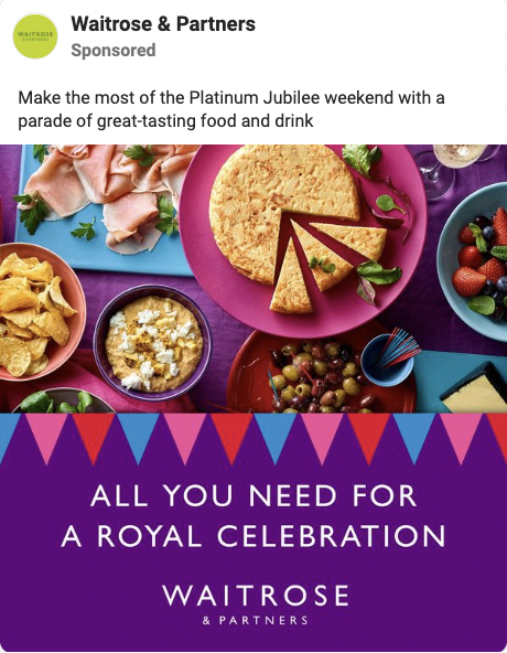
Here’s a few examples of landing pages for the Platinum Jubilee this weekend:


2. Theme up on socials

Make sure to commemorate the event on your socials, whether that’s Instagram, Facebook, TikTok or LinkedIn. 

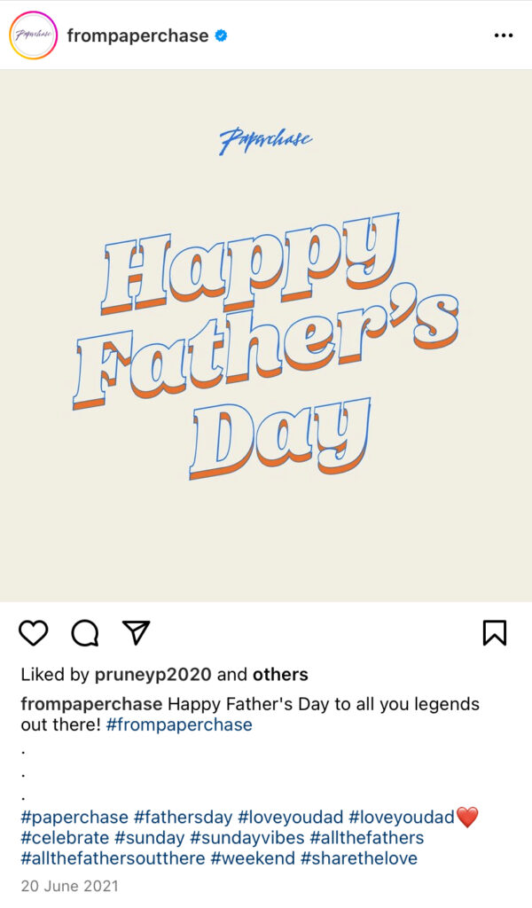
Use relevant hashtags to increase your reach, and consider creating an eye-catching graphic that pulls attention on the quickest of scrolls. Add creative captions that are on theme and contain an engaging CTA to drive site traffic, perhaps even promising an offer when you visit the website.

Here’s an example from Paperchase’s Instagram :

If you’re extra keen to capitalise on a themed date, consider a themed hashtag challenge on TikTok. Create a custom hashtag for customers to use on their own videos featuring your products – this will engage your audiences and build brand awareness.


3. Engage on email

Your email marketing gives you a stellar opportunity to let your creativity take the stage with themed dates. Create a themed template with creative copy, engaging CTAs and promote any themed offers you’re running. These could be VIP sales on certain products, or code-unlocking bundle deals.

Remember – your subject line is incredibly important if you want to boost your open (and click) rates. Write an attention-grabbing subject line that would stand out in your inbox, making use of on-theme emojis where appropriate.


4. Grab attention on ads

The final part to consider devoting attention to is your paid Facebook and Google ads. Target and attract new audiences with themed graphics, and retarget existing audiences with any on-theme promotions you’re running. It’s a sure-fire way to drive traffic with clear relevancy and exciting exclusivity.


All in all – let your creativity run wild, and invest time in upcoming marketing dates to take your brand to the next level. Note down the upcoming themed dates you could use to your advantage and plan ahead – so you’re ready to drive that traffic and sales when the day rolls around.


In need of a bespoke marketing strategy to take your business to new heights? Get in touch with our team today – we’re very happy to help your eCommerce brand with social media strategy, paid advertising and email marketing.

Our results-driven method keeps us ahead of the game – perfect for creating high quality, ultra-relevant content for your products/services. Book a call with us today – we can’t wait to find out more about your business.