Social Nucleus

Categories
Uncategorized

5 Ways to Market Your Product as GREAT Value

5 Ways to Market Your Product as GREAT Value

A question we all ask ourselves as customers is “how do I know that what I’m paying for is worth a lot more than my investment?”. As a brand, it’s your job to answer this question by offering massive value through your advertisement strategy.

You want your product/service to appear good value for money, so today’s post is going to walk you through how to do this in your marketing campaigns.

Value Proposition

As mentioned above, you want to make sure you answer the customers burning question. How can you portray your product or service as good value for money? Firstly, by using the prospects language. You want to address their pain points, establish what they want to achieve and what results they want to see. You then need to decide upon how to convey these points in your ads.

One way we suggest you do this is to use the framing effect. This is when we look at not what is said, but how it is said. You want to find the relationship between context and information as it determines meaning. Let us give you an example. You can break down the cost of your product per day, or per use to make it seem more affordable and better value for money. What sounds better?

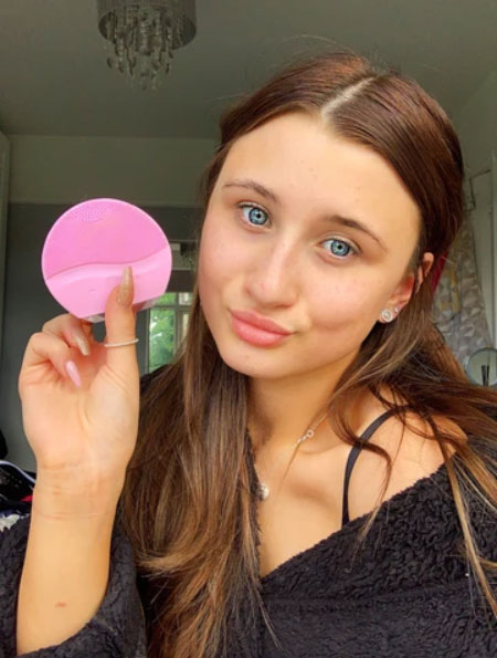
“Our skin cleanser is now just £354!”

…or

“our skin cleanser costs just 90p to use each day”

You see the point here? Next time you’re writing about your product or service, break down the cost in any way you can. It appeals so much more to your customers if they can see the cost benefits.

Comparison

They say you should never compare yourself to others, but in the marketing world, you should. Look at what your competitors are doing what their prices are and how they differ to yours. Can you beat their price? If so, tell people! If you can offer the same thing, if not better for a cheaper price, people will jump at the chance to buy your product if it seems better value. By comparing your prices to competitors, you instantly market your product as good, if not better, value for money.

It’s also worth noting that when comparing to competitors, it’s important to state your benefits too. Why should the consumer choose you over them? Sometimes, it’s not all about money.

Benefits and Monetary Value

Following on from our last point, marketing isn’t always about money. You need to make it clear to audiences what the benefits of your product or service are.

If your product is slightly more expensive than competitors, you need to state why. If customers recognise that they are paying more but getting way more in return, you’ll likely improve your conversion rates.

Bonuses

Another way you can make your product seem better value is by introducing a bonus to your deal, but always keeping it relevant to your main offer. Don’t sell your product and bonuses as a packaged price. You want the bonus to appear free.

For example, don’t tell customers that your main the product costs £200 and the two bonuses cost £50 each so your prospect must pay £300. You want to make it seem that your product costs £300 and the two bonuses are free (but worth £100).

Risk Removal

The final way you can add value to your product or service is to remove any obstacles that may stand in front of your prospects. They need to be powerful and allow your customer to trust you. An example of this is money back guarantee. One way to take this even further is a longer money back guarantee. Its proven that having a longer money back guarantee results in less refunds. It reverses the risk for the customer as you are taking part in the risk. This is a way to frame money back guarantees in a positive way.

So, there you have it. 5 ways market your products as good value for money! Think about these techniques next time you start your marketing campaign.

Categories
Uncategorized

How to Get Ads Approved (and Disapproved) with Ease

How to Get Ads Approved (and Disapproved) with Ease

If you’re a frequent Facebook advertiser, you will understand the struggles of getting your ads approved (or disapproved). Since launching in 2007, Facebook have adopted a very strict approach to their guidelines. They are very particular on what they approve and what they disapprove. If you’re new to paid ads, this may be news to you. Luckily for you, we’re here to breakdown the myths and jargon and explain to you exactly what you need to do in order to run successful Facebook ad campaigns. 

Words and Phrases we know to avoid

Firstly, there are many words and phrases we can avoid using when advertising on Facebook. Facebook maintain some policies that address discrimination and personal attributes.

You cannot directly discriminate against or demean people based on attributes such as race, religion, gender and ethnicity. This means you cannot mention any of these factors in your ad copy or creatives. This also applies for your targeting. If you target such factors too specifically, it can appear that you are unfairly discriminating against certain groups.

Regarding personal attributes you cannot mention anything to do with self-image, mental health, physical features, etc. When we write our client ads we often avoid using “you where possible. For example:

Where you may normally use “do you want your smile to be brighter?”, we would change this to “want a brighter smile?”. It’s important to remember than many ads are reviewed by bots, not humans. They will often reject ads that contain the words “you” or “your”, even if used correctly. It’s not worth the hassle of appealing this review and waiting even longer for an actual person to have a look at your ad. If you can avoid using these phrases, you will save yourself a lot of time. 

Types of brands we know Facebook doesn’t like

Before setting up your Facebook ad account, you want to be sure that the products you’re selling aren’t subject for an automatic Facebook ad ban. Here are some of the brands or products that are currently not allowed to advertise on Facebook.

  1. Illegal products or services – Well, this goes without saying. Anything that would get you arrested or fined for selling in the real world, applies to Facebook advertising. This includes selling age-restricted products to minors. 
  2. Tobacco and related products – Cigarettes, vapes or any product that resonates with smoking in banned.
  3. Drug and related products – This covers both illegal and prescription drugs. Some CBD brands also have a hard time advertising, as this is also not allowed. 
  4. Unsafe supplements – Anything to do with steroids, Human Growth Hormones or any kind of dodgy supplements are not allowed. Facebook’s policy on this is very clear. They get to decide which products are included in the category, so their decision is always going to be subjective.
  5. Weapons – This includes weapons, ammo and explosives. It also covers pepper sprays, tasers, non-culinary knives. You can however, advertise holsters, and toy guns as long as your audience targeting is over 18. 
  6. Payday loans – Any loan with a term of less than 90 days is banned.

When advertising restricted products, we advise you to be very careful about it. For example, make sure your ads are targeted to over 18 in the UK for advertising alcohol, and over 21 in the states. You must be aware of the laws and target accordingly. 

Power of the landing page

When Facebook reviews your ads, they don’t just look at your ad. They also take into consideration the URL your ads link to. It’s important you set up a strong landing page, to avoid any rejections. This is also important for some businesses such as medical, as you can really showcase your products without breaking any rules.

Here are some URL/landing page characteristics that could get your ads rejected by Facebook.

  1. Disruptive content – If your landing page is hard to navigate and requires users to click many buttons just to read your article, Facebook will block it straight away. You want your landing pages to be simple, easy to navigate and easy to read.
  2. Irrelevant landing pages – If your ads have nothing to do with your landing page, your ad will not be approved. It can look like your using your ads to mislead traffic to your website. 
  3. Misleading URL’s – Similarly to the above point, your landing page’s URL must be of relevance to your ads. If it looks misleading, the likelihood is, it wont get approved. 

New ad accounts

It’s important to remember that if your ads keep getting rejected, it’s likely your page will end up being banned all together. That’s why we stress the importance of the above. There are so many steps you can take to create your ads carefully.

However, if your page has become permanently disabled from advertising, you shouldn’t connect it to new ad accounts. Facebook will pick up on this, and it can lead to more serious bans, resulting in you never being able to advertise on Facebook again. Unfortunately, if your page has been disabled, there’s not much more to do.

In order to avoid this, follow the above steps, know your audience, choose your copy and creative wisely and set up a strong and relevant landing page.

If you still feel that you need help with your Facebook ad account get in touch today. Our expert team are available for a FREE strategy call and are ready to help your Facebook ads skyrocket!

Categories
Uncategorized

7 At-Home Content Ideas to Try For Your Ads

7 At-Home Content Ideas to Try For Your Ads

Lockdown has seen a huge struggle across a lot of businesses to source good content. Photoshoots have been put on the backburner, human contact has been minimised, and creativity has come to a halt. Thankfully for you, we’re here today to share with you 7 (at-home, of course) content ideas you can try to spruce up your ad game until normality is resumed!

Click transition

Click transitions are a hot technique for video ads right now and they’re easier to film than you might think.

  1. Set up a tripod with your phone or camera in position 
  2. Film the first frame and click at the end – stop filming 
  3. Adjust the frame in whatever way you need (change the product, add a product, outfit change, etc)
  4. Start filming the next frame by clicking in the exact same spot as you did at the end of the first frame 
  5. Use your video editing software to merge the two clips together, switching from the first to the second during the click transition (this takes practise) 

And there you go – a cool new video ad that took minutes to film.

Product on ice

This ‘product on ice’ video is seriously simple to shoot at home and looks mega eye-catching on the feed.

  1. Fill a bucket or bowl with ice and place in front of a window 
  2. Place the product on top of the ice 
  3. Spray the product with water 
  4. Film the pro duct use a ‘Sparkle Effect’ app 
  5. Export the video and add text/music on iMovie 
  6. Test in your ads!

Thank us later for this one…

Reviews

Reviews are always a go-to for creating at-home content. They’re simple and easy to do and are amazing at increasing conversions and social proofing your brand.

Simply sit in front of your camera, switch it on, and talk about your product. Why you love it so much, how it improves customers life’s, and why they NEED it. Try not to ramble. Prepare some points before hand ready to edit into a stunning transition for your ads.

If speaking isn’t for you, you can always write a review. Short and simple reviews with good points are perfect for using in your ad copy.

Product demos/how to

Informative ads always catch attention, increase engagement and boost your conversions. Everyone loves to learn something new, so watching your product in use is sure to gain a few views.

Informative ads often perform better than others. It allows prospects to see the product in use, see how easy it is to operate and encourages them to buy. It adds a certain layer of trust to your ad campaigns and is guaranteed to boost those conversions.

Selfies

One of the simpler options here – selfies. Easy to do but very effective. Using selfies as a form of marketing helps keep your brand relevant to what’s trending. It also helps you stay aligned with visual marketing effectively and allows you to understand how people use photography.

Selfies humanize brands, creating an emotion-driven scenario making your marketing messages more personal and relatable. Simply grab your product, smile and take a snap!

Unboxings

Unboxings are a new and effective way to showcase your products and make an interesting video at the same time. Unboxing videos are extremely popular on YouTube racking up millions of views and the same can go for your ads.

People use unboxing videos for research. They can’t physically touch your products, but an unboxing video is the next best thing. They’re entertaining and engaging and great to test in your ads.

Lifestyle images

Lifestyle images are frequently thought of as the best-performing content. They are suitable for almost all businesses and any advertisement or promotion. Lifestyle images are simply pictures that depict people in a life-related activity. They are so popular because humans respond more positively to seeing people in images than any other subject.

Taking lifestyle images at home with your products is a super easy way to build up a huge bank of content for your ads./p>

So, there you have it, our top 7 at-home content ideas. We hope this post has got your creative juices flowing and provided you with some inspiration to create some smashing ad content from the comfort of your home!

Categories
Uncategorized

4 Accounts to Get Marketing Inspiration

4 Accounts to Get Marketing Inspiration

When the inspiration runs dry, where better to turn to than other marketing personalities. There are so many great accounts out there that churn out amazing content to get the cogs flowing, so for today’s post, we thought we would share with you our favourite accounts to turn to when you need a bit of content or marketing inspo!

Social Savannah

Social Savannah is one of our favourite accounts to delve into when we’re feeling dry on the inspiration front. With over 5 years in the industry, Savannah is an expert in paid social strategies for eCommerce brands. On her Instagram and Twitter platforms, she shares paid social updates, strategy tips, content inspiration and SO much more!

You can find her here – www.thesocialsavannah.com 

Belinda Weaver

When it comes to copywriting, Belinda Weaver is your woman. She is the founder of CopywriteMatters, a copywriting business and community. She shares lots of free copywriting advice through her blog and social channels. She has also created copywriting groups on LinkedIn and Facebook, connecting copywriters all across the globe. If you’re looking to brush up on your copy skills, this is the place to be.

You can find her here – www.copywritematters.com 

AdEspresso

AdEspresso is the advertising focused blog run by Hootsuite. Their blog covers everything you could ever imagine to do with Facebook and Google advertising. It is one of the best resources to keep up to date with Facebook and Google Ads news and tactics to run successful campaigns that convert!

You can find them here – www.adespresso.com/blog 

Ad Alchemist

Another blog that we love over here at Social Nucleus is Ads Alchemist. A blog ran by an anonymous individual who has over 7 years’ experience in Facebook ads. They have launched their own blog giving readers a continuous stream of free, actionable Facebook ads content. Their Twitter page is particularly useful in sharing top tips so if you’re an active user over there we recommend you drop them a follow!

You can find them here –  www.adalchemist.com 

So, there you have it. If you ever need some marketing inspo to kickstart your next project, give these accounts a little attention! We’re confident they’ll give you the boost you need to smash your business goals.

Categories
Uncategorized

The Psychology of Colour in Advertising

The Psychology of Colour in Advertising

When it comes to content marketing, colour is key. Colour psychology has been around for years. It is an area of research that examines how colour influences our behaviour as consumers. Different colours can impact the way buyers perceive a brand in ways that aren’t always apparent.  It is an emotional cue that can help your audience feel what you want them to feel simply by using different colours and is why understanding colour psychology is so important for the success of your content.

Using the wrong colour choice can negatively impact your advertising and send out the completely wrong message. Today, we’re going to go over the main colours, what they mean for your advertising, and where to use them.

Red

Red is a very powerful and dynamic colour. It triggers powerful emotions, both positive and negative. It often represents our physical needs, whether that’s affection, love, fear or terror. Red is also a very energising colour that can portray friendliness and strength, but depending on its context, can be very demanding and show aggression.

If you’re looking to portray a really powerful presence or to grab audience’s attention fast, red is the colour for you. That’s why you will often see sale signs in red as it creates a sense of urgency. Just a warning, be careful using red, as it does carry some negative connotations. Use it sparingly.  

Orange

Orange is a very warm colour and has similar connotations. This mix of yellow and red represents physical comfort. Orange is often associated with motivation, a positive outlook and general enthusiasm. 

It’s a fun and bright colour, so often suited to a non-corporate brand. Orange is also thought to induce feelings of hunger, meaning it could be a perfect choice for a food brand!

Interestingly, orange has been associated with cheapness, so be careful using orange if you’re going for a luxury vibe.

Brand Example: Burger King 

During their iconic rebrand, Burger King have gone for an eye-catching pop of orange in their new logo which works perfectly given their key intention is to make customers hungry. They also don’t need to worry about about ‘cheapening’ their brand as they sell themselves as affordable, attainable fast food. 

Burger King - Wikipedia

Yellow

Everyone loves yellow. Yellow is the epitome of joy, happiness, cheerfulness and optimism. Anything yellow almost always represents something happy and joyful. It’s been proven that infants first respond to yellow above any colour, proving that yellow is the easiest colour to visually see. 

You should use yellow to lift people’s spirits and confidence but should be used carefully as yellow often has connotations with anxiety, caution and fear. If you know your brand is strongly associated with confidence and happiness, use it. If there’s any room for doubt, avoid it. Find the right balance to motivate your audience instead of bringing them down.

Brand Example: McDonalds

McDonalds’ iconic ‘M’ in their logo is a great example of colour psychology. They want their restaurants to be the epitome of happiness, fun and good food. The yellow colour of their logo helps customers associate these feelings with their restaurant.

McDonald's - Wikipedia

Green

Green is a lovely colour of balance and harmony. It’s a visually appealing colour, easy on the eye, which gives us a clear sense of right from wrong (due to the fact that it incorporates a balance of both the logical and emotional). Green is the colour that represents natural life, rest and peace. It’s also a sign of growth, whether that be physical or financial. 

Green is a very common colour used across health and organic brands, as well as pharmaceuticals.  

If you’re looking to portray health, rest, growth, or finance, green is the colour for you. Green does have some negative associations with possession and materialism; however, the positive connotations outweigh the bad in this case.

Blue

Blue is famous for its reflection of trust and dependability. It has a very calming effect on the mind and is often referred to as the colour of reason. 

Unlike the colour red, blue tends to create a mental reaction, as opposed to a physical one, that allows us to destress and calm down. It’s the colour of mental strength and wisdom.

Of course, blue does have some connotations of sadness, coldness and can often make you appear quite distant if used in great amounts. Use this colour with caution and only if it fits your brand. 

Purple

Purple is a colour associated with the imagination, spirituality and royalty. It possesses all the energy and power of red, alongside the stability and trustworthiness of blue, making it the perfect balance between the physical and spiritual. 

If you’re a luxury brand, this is the colour for you. It is often seen as quite a moody colour, and different tints of purple can be used to represent femininity.

Purple is a very intriguing colour, but also leaves space for mystery and new ideas. Creativity is often associated with this colour. However, you should avoid using this too much as it can leave a bit too much room for introspection and distraction. 

Brand Example: Cadburys 

Cadburys is actually a really interesting example as their iconic purple packaging doesn’t necessarily relate to any of the typical emotions related to this colour. They’re an affordable, every day brand using colours often associated with royalty and wealth. This is a perfect example of how iconic brands can redefine the psychology behind colours and often do. 

Bulletproof redesigns Cadbury and Dairy Milk to “put the humanity back into  it”

Pink

Pink often represents compassion and unconditional love. It’s often seen as a very physical and soothing colour, associated with hope and romanticism. It is also the most widely used colour to portray femininity. 

If used too much, pink can be very draining, display a lack of power and even come across immature. Pink is great to use instead of red when appropriate.

Black

Sophistication, seriousness, control and independence are all associated with the colour black. It is a very reserved colour, that lacks any light. It is synonymous with luxury and power and is often well suited to fashion industries.

Black can also be used to shoe evil, mystery and even death, so as you can imagine, using too much of it can create an aura of sadness and negativity. So, use it sparingly. Maybe use it more in your text than visuals themselves.

Gold

Gold is thought to be a rich colour that represents royalty, wealth and money. It has connotations of charm, confidence and friendliness, so is best used for brands that are friendly and conversational. It is more often than not a positive and inspiring colour. 

However, when used too much in one space, gold can feel egotistical, self-righteous and too proud. Try to use this colour sparingly to highlight, rather than be the main centre-piece. 

Silver

Silver is commonly associated with ‘second place’ or second best. It is still seen as a somewhat wealthy and regal metallic but less so than gold. 

It is also a colour synonymous with cleanliness and has become the go-to for modern brands. However, if poorly executed, it can look lazy and lack personality. 

Silver is thought to trigger the emotions of hope and sensitivity. It is believed to be the mirror to the soul. It is this association that also makes silver feel clean and trustworthy. 

Silver feels sturdy and reliable meaning it is often a positive colour in the marketing world.

Now, you should be a colour psychology expert. Next time you are creating your visuals or thinking of your next big campaign, refer back to this article. You cannot know how your audience will respond to your colour choices without creating thoughtful A/B tests to determine which colours generate the most sales.

Still need some help with your content? We have an amazing in-house team of graphic designers who can help you determine the best colours to use for your marketing campaigns.